





Feature spotlight

Aug 7, 2026 • 2 min read

In This Blog
A client-facing delivery consultant running a twelve-week platform rollout doesn’t have one audience, they have two.
Internally, the team needs every task: QA passes, config subtasks, the small stuff. On the weekly client call, none of that matters. Screen-sharing the full two-hundred-row Gantt chart means scrolling past ninety percent of what the client doesn’t care about just to point at the eight milestones they’re actually tracking, or rebuilding a separate timeline slide every week outside Jira, which means maintaining two versions of the same plan.
WBS Gantt-Chart for Jira’s Summarized Timeline view solves this without leaving the app. Turn it on from the View menu, then open the Columns menu and check “Show in timeline.” That adds a toggle column to your WBS.
Click the pencil icon on any task or milestone to mark whether it should appear on the summarized view. Nothing about the underlying plan changes; you’re just choosing which rows surface on the condensed timeline and which stay in the full working plan underneath.
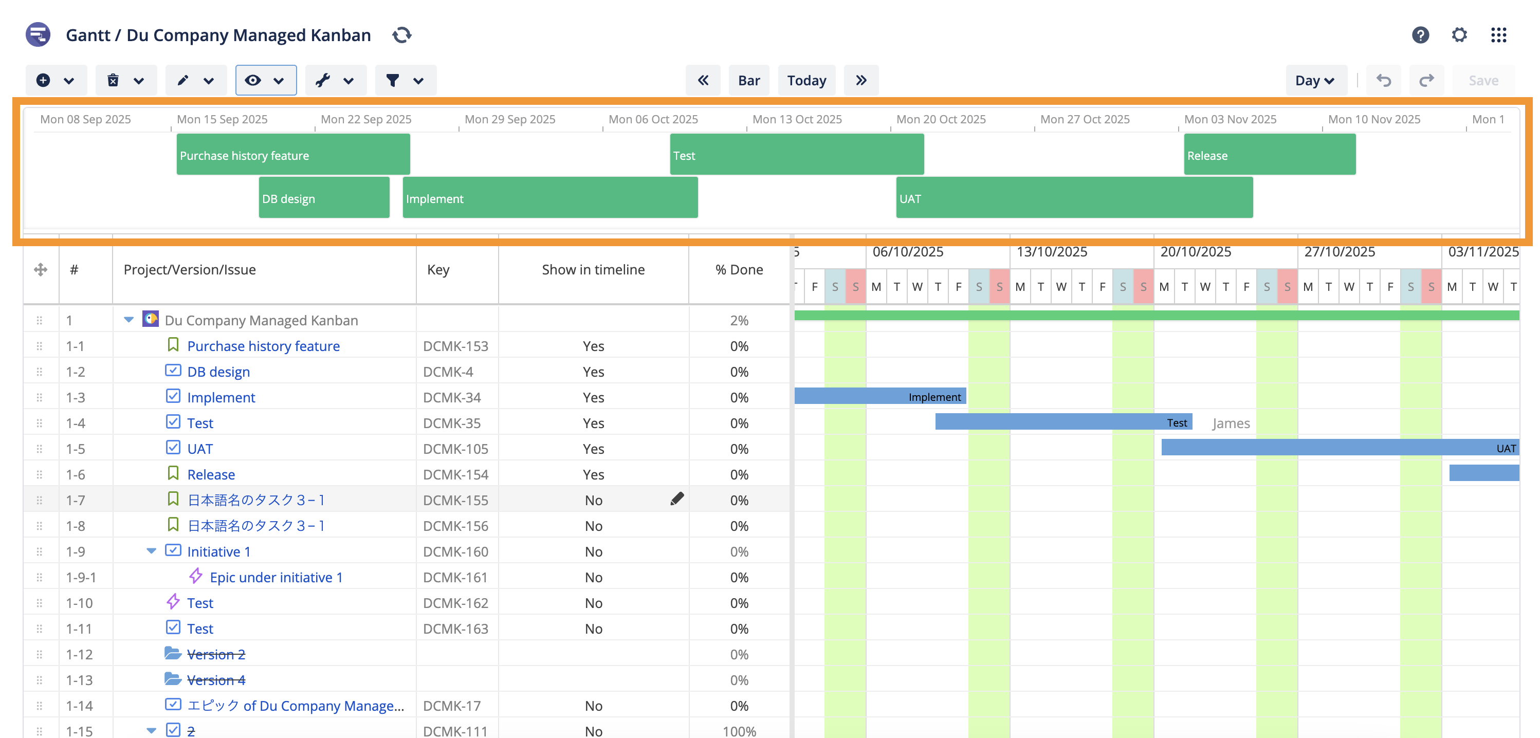
Picture a consultant running that same rollout. She tags eight real milestones: kickoff, data migration complete, UAT start, go-live, as “Show in timeline” and leaves the other hundred-plus subtasks off.
Every Friday, instead of opening the full Gantt chart, she switches to the summarized view. The client sees exactly the eight things they’re tracking, pulled live from the same Jira data the team works from all week; No separate deck to update, no explaining which rows to ignore.
The plan doesn’t need to get simpler just because the audience does. The same Jira-native data drives both views: the full plan for the team, a curated one for anyone who only needs the headline.
Full setup steps, including how the “Show in timeline” column and the pencil-icon toggle work together, are in Summarized timeline.
Not using WBS Gantt-Chart for Jira yet? Start a free 30-day trial to see how it works for your team.