Project Management

Dec 22, 2022 • 6 min read

In This Blog
Clear communication either makes or breaks a project, and project and product managers (PMs) should know it well. From keeping track of deadlines to ensuring everyone understands a project’s timeline, a good PM ensures that nobody gets left behind.
This is where visual project management steps in. Unlike more traditional, time-consuming methods (e.g., lengthy multi-page reports), with visual project management you rely more on visuals such as graphs, mindmaps, diagrams, calendars, and so on to communicate project information. By doing so, you instantly get to see the bigger picture as information is conveyed instantaneously, saving significant amounts of time that can be spent elsewhere.
In our article, we’ll go over the benefits of visual project management, best practices to keep note of and the best tool for visual Confluence PMs.
Visual project management is the practice of both displaying and thinking about non-visual data visually by taking otherwise monotonous datasets and transforming them into something more visual. Though this isn’t a new approach in the context of project and product management (e.g., Gantt charts), visual project management puts a greater emphasis on visualizations. It has gained traction over the past years, proving itself highly effective, considering that the majority of the population are visual learners.
Simply put, visual project management not only summarizes swathes of data neatly, but it also ensures everyone—from teams to stakeholders—rapidly digests and understands everything related to the project, keeping things clear and on track to success.
The benefits of visual project management extend far beyond keeping everyone in the loop. Here are some of the most important:
Visuals provide a clearer and more comprehensive view of any project, which helps teams quickly observe the bigger picture, how things fit together, and the full scope of the project’s lifecycle. With this added dimension of visibility, decision-makers will be able to allocate resources more effectively and identify potential risks. Individual team members will also comprehend their tasks better and know how they relate to the broader project.
This aspect will prove especially valuable in minimizing the occurrence of information silos for project teams comprising a large number of individuals and divisions.
Ever hear the saying a picture is worth a thousand words? It’s a fact that humans process visual information quicker than traditional formats, and this applies directly to visual project management. Instead of tediously combing your way through mountains of dry datasets, visualizations cut through the noise, neatly summarizing and presenting otherwise monotonous reports into concise visuals.
But beyond minimizing time otherwise wasted on digesting and analyzing datasets, visualizations have also enabled teams to draw up new insights and connections between project elements (e.g., tasks and milestones). This aspect could be invaluable in providing teams with the ability to generate quicker and more innovative solutions.
An ongoing project is almost akin to a living thing: things change and develop over time, sometimes unexpectedly, which is why PMs have to ensure that their teams can rapidly adapt and react to such changes. The inability to do so has been the downfall of countless projects, all the more stressing its importance.
When implemented properly, a good data visualization would be able to reflect such changes almost instantly, allowing teams to sync with each other and the project’s evolving needs.
Visual project management is more than a framework. It’s an entire skill set that can take years to master. To help kickstart your journey, here are some best practices to always keep in mind:
Not all visuals are equal. Depending on your specific situation, some will be better than others, while others might be entirely unsuitable. For instance, in terms of timeline management, Gantt charts would be a great option when laying out multiple tasks with clear start and end dates. Likewise, when presenting data, bar charts would be ideal for quantitative data, whereas scatterplots would be suitable when comparing two variables to tease out deeper relationships.
Simplicity is the name of the game for all things good data visualization. The point of the entire framework is to shave down on the amount of time needed for team members to process information. If you bog them down with needlessly complicated and fancy visuals, you’ll just end up back at square one.
Regardless of whether you’re creating a complex Kanban board or a humble bar chart, before creating the visual, you have to ensure your data is as error-free and accurate as possible. This is what data cleaning is all about: meticulously combing through your datasets while editing and removing whatever isn’t relevant, such as duplicates, miscalculations, outliers, and missing data.
Taking advantage of customization is a great way to tailor visuals according to a project’s unique requirements. Certain colors (e.g., red) can emphasize the urgency of a particular task; additional annotations or labels are a great way to introduce further explanation if necessary; and filters can be utilized to sort data to focus on specific points.
Good PMs know at heart that it’s just as important to use the right tool for the job as it is to use the right approach. While visual project management is a fantastic concept, to fully realize its benefits, PMs will need to deploy the ideal solution.
Enter: Excel-like Tables for Confluence
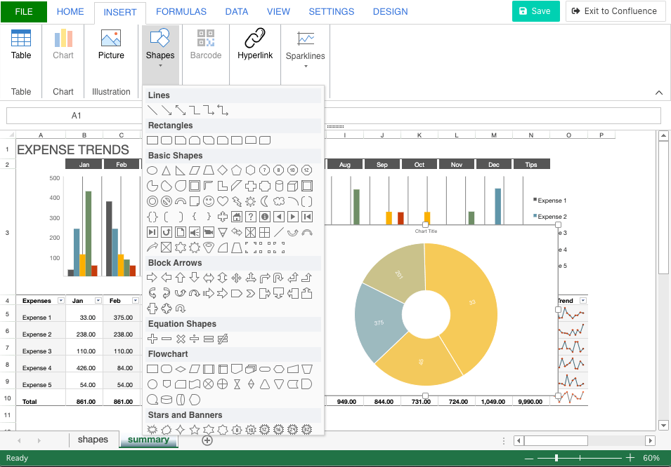
Designed by Ricksoft with project and product management needs in mind, Excel-like Tables for Confluence is the perfect companion for the visual PM, making it one of the best visual project management tools on the Atlassian Marketplace. By combining Excel’s powerful functionalities with Confluence’s collaborative strengths, PMs can create just about any visual for their visual project management needs, from Gantt charts to pie charts and mind maps.
Even beyond visuals, the app allows PMs to take everything further with data analytics in Confluence. With full access to Excel’s pivot tables, an extensive range of formulas, and the ability to import and export.xlsx files, Excel-like Tables for Confluence provides all that a visual PM would need and more.
Alternatively, if you’re looking for something similar but for Jira, feel free to check out Excel-like Tables for Jira!
As projects keep growing in complexity, visual project management is becoming increasingly adopted by PMs striving to stay competitive in today’s fast-paced environments. With all the benefits it stands to provide, it would be remiss not at least to give it a chance.
Why not start by using our visual project management solution today?