Data & Reporting
Dec 15, 2022 • 6 min read

In This Blog
Data visualization is far more than just adding vibrant colors and shapes to spice up the monotony of numbers. It’s about processing and thinking about data in a whole new way. It helps decision-makers forge new insights through an entire host of benefits, such as viewing things from a fresh perspective and communicating insights more clearly to non-technical audiences. In today’s data-driven world, embracing data visualization is more and more vital for product and project managers (PMs) hoping to stay competitive.
Even though Confluence is a fantastic solution for PMs, it isn’t always ideal for full-on data visualization. And this is where our article steps in. We’ll talk about the importance and benefits of data visualization for project management, address Confluence’s limitations, and suggest tools from the Atlassian Marketplace that boost Confluence’s data visualization capabilities.
We’re all naturally drawn more toward dazzling visuals than plain numbers. Visuals, from graphs to charts, help us process large swathes of information almost instantly, translating dense data (e.g., spreadsheets) into something more appealing and readily digestible. But the range of data visualization benefits extends far beyond this:
When presented visually, data helps teams identify previously unnoticed trends, patterns, and correlations between related variables. With these newly formed insights, teams can rapidly analyze data and use it to inform key decisions.
While teams can still technically get to these insights without visualizations, it would generally take them more time and effort, precious resources that could otherwise be utilized more efficiently in other areas. In addition, some relationships may go completely unnoticed if they are not readily observable and visually represented.
Data visualization doesn’t just make datasets look prettier. It also makes them more engaging and understandable for everyone involved, from experts to general audiences. This may sound a little obvious, but it goes a long way in supporting both data democratization and accessibility.
Consider this: in any given team and organization, skillsets tend to vary by individual. More technical members (e.g., engineers) may be more data-savvy than non-technical members (e.g., illustrators). In a team, every voice matters, which is why addressing communication gaps is crucial. This is precisely what data visualization can achieve: it translates otherwise inaccessible information into something readily understandable by all.
Data visualization helps decision-makers on two fronts: speed and accuracy. But how exactly does data visualization improve decision-making? In terms of speed, visualization can help teams process and interpret information far quicker than usual, even shortening the time required to make decisions during business meetings by close to 25%.
And on accuracy, data visualization can help decision-makers see the bigger picture with everything neatly laid out, which allows more accurate decision-making. However, the above also depends on the visual being both suitable and properly designed in the first place! On this note, to learn more about the decision-making process in general, why don’t you give our take on the subject a read?
Confluence is a fantastic project and product management tool. However, while it does provide some degree of data visualization, its simplicity will prevent users from realizing the full benefits of data visualization:
While charts and graphs are a crucial part of data visualization—especially, for teams who want to stay competitive—they only scratch the surface of what’s needed. Users will find themselves limited to basic visualization options on Confluence, such as simple pie charts and bar charts. In other words, Confluence isn’t capable of advanced visualization for more complex tasks such as Gantt charts.
Confluence’s narrow selection of visualization options also applies to customizability. Beyond inputting data, what you see is what you get in terms of visualization. Confluence simply doesn’t allow for deep customization, such as changing the font, ordering data, playing around with different color schemes, hiding certain data, and so on.
Native Confluence may be great for communication between teams and establishing a single source of truth (SSOT) but falls short when analytics is involved. Users will be able to create tables and graphs but will need to defer to external solutions such as Microsoft Excel if they intend to perform even the most basic of analytics (e.g., SUM, AVERAGE).
Getting around the issues above is straightforward with the help of third-party apps on the Marketplace. A quick search will reveal an abundance of data visualization tools out there for Confluence users, but here are some of the best based on our experience:
Living up to its name, Dutch Beginners’ Simple Charts for Confluence helps PMs painlessly translate their numerical data into clean visuals. Users will be able to quickly configure the charts to their liking based on any existing data on their Confluence pages in a matter of seconds with just a few clicks.
Unfortunately, as its name suggests, simplicity is the app’s greatest strength and drawback. Users will be restricted to only line charts until future updates add a greater variety of visuals.
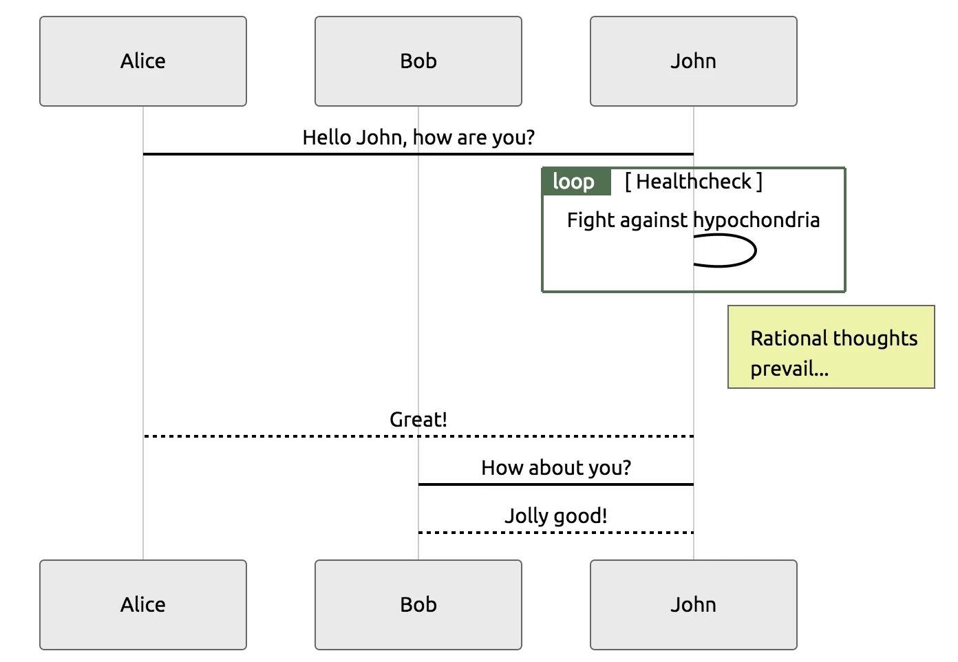
Mermaid Plugin for Confluence is a free, nifty solution that leverages JavaScript to provide users with a Confluence macro that seamlessly transforms plain text into visualizations. With Mermaid’s JavaScript library, users will have access to various options, including graphs, sequence diagrams, and even Gantt Charts.
That said, users looking to conduct data analytics on top of visualization and in-depth customization might be left wanting more.
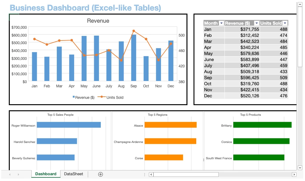
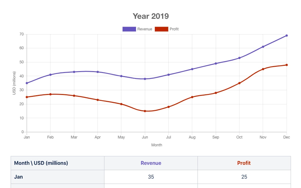
Ricksoft’s Excel-like Tables for Confluence bring the full power and versatility of Microsoft Excel right onto Confluence’s doorstep. Users will have full access to Excel’s arsenal of graphs, charts, and tables that include pie charts, scatter plots, and anything else a PM might require for their visualization needs. Users can also utilize Pivot Tables and over 450 built-in formulas that include the simple (e.g., AVERAGE) to the complex (e.g., NPV).
Given the functionality of Excel-like Tables for Confluence, there is a slight learning curve, but with the vast number of supporting resources available, overcoming this shouldn’t be a problem.
The advantages of data visualization for Confluence are ripe for the taking with the help of add-ons and should be considered by PMs wishing to stay competitive. Nonetheless, finding the ideal solution for your needs is a process of trial and error that requires you to experiment and compare various data visualization tools.
Why not begin your journey with our Excel-like Tables for Confluence today?