Making the most out of your data doesn’t have to be complex. Learn how to do it all from the comfort of your wiki.

Businesses that continue—and will continue—to survive and succeed in today’s fast-paced world are businesses that know how to work with data. These businesses are more commonly known as data-driven businesses. Each team in your organization, no matter how big or small, is sitting on volumes of data waiting to be harvested. When you find a way to not only collect data, but use data to draw intelligence and discover new insights about your operations, you can be sure that your business is more likely to succeed than your competitors. If you’re wondering what’s the best way to start, data analytics and data visualization are your answers.

A report by Forrester affirmed this; data-driven businesses grow at an average of more than thirty percent (30%) annually.

Additionally, fifty-nine percent (59%) of businesses use comprehensive data capabilities to make better decisions and improve business performance.

Citing McKinsey Global Institute, data-driven businesses are:
According to Project Management Institute (PMI), “Project management is the use of specific knowledge, skills, tools and techniques to deliver something of value to people.”
Data analytics refers to the process and the tools used for analyzing datasets in order to gain insights and intelligence, which can then be leveraged to drive business decisions.
You have collected data on your newsletter performance. Now, to make sense of how your audience is interacting with your emails, you need to analyze the data to look for behavioral patterns. So, if the data tells you that your audience is not opening your newsletters, then your next step could be improving the email subject line.
The more comprehensive the tools you use, the more in-depth the data analysis will be; consequently, the more definitive businesses can be in their decision-making. One of the most commonly trusted data analysis tools is the good ol’ Excel.
Data visualization refers to the use of graphics and illustrations to represent data and information. The types of visualization include:


The tools used for data visualization help turn raw or unorganized data into comprehensible insights and intelligence. By using visualizations, your data becomes a more accessible and amiable reference point for all that consume it.
Like data analytics, one of the most basic tools used for business data visualization is Excel.
If you need a quick way to communicate the benefits your solution offers to your client’s bottom line, then an infographic can do the trick. If you want to communicate revenue growth across your organization, then a line or bar graph would be appropriate.
The table below shows the differences between data analysis and visualization.
Data Analytics |
Data Visualization |
|
| Definition | The process of analyzing data to draw insights and gain intelligence. | The process of using graphical elements to represent data for greater tangibility. This can come after data analysis. |
| Goals | To make sense of any business data and drive better decision-making processes. | To help communicate business data more efficiently and capture the big picture in business story-telling. |
| Use case |
|
|
| Capabilities in Confluence | Very limited but can be expanded using the right Marketplace apps. | Basic table capabilities are offered together with a number of charts that can be created using Jira issue data. |
Download this free table for your reference by clicking here.
Having the right data analysis and visualization capabilities can help set you apart from your competitors because not only do you have the means to work with your data, but you also have the leverage to scale your operations more effectively.
Other benefits are as follows:
You can identify relationships between your independent data effectively to draw new insights and intelligence.
You can make more informed decisions about your next steps; this applies to decisions made on the organizational and departmental level.
You can improve your operational strategies as you know what has worked and what hasn’t.
You can enhance project management efficiencies as team members can turn project insights into actionable goals.
You can help your team members to stay aligned with project timelines using comprehensive data visuals.
You can improve productivity and revenue growth because your data tells stories about how your teams are doing.
You can be more alert to changing market conditions and buyer behavior, allowing you to respond effectively.
In the long run, you can positively impact your bottom line by enabling your teams to continuously make improvements based on first-hand insights.
While it’s important to have the right talents in your company who don’t only understand data but know how to work with data, you also need to make sure that they have the right tools to use to perform analysis and visualization.
This brings us back to Confluence.
Yes, but mainly, no.
To say that Confluence is “equipped” with data visualization and data analytics capabilities is quite a stretch. As a highly renowned collaboration and knowledge management tool, Confluence does enable users to create and scale wikis to support various business needs. You can also store your data in Confluence easily.
Unfortunately, as you scale your business, managing volumes of data isn’t going to be that easy, considering that Confluence’s table function alone is limited.
While you can document and store your data in your wiki, you cannot manipulate it or perform analytics as the capabilities are nearly non-existent.
On the other hand, you can create charts and graphs from scratch in Confluence, but the process itself is pretty manual, and you have to fill up numerous fields on the sidebar just to create one type of chart.
Needless to say, in-depth reporting capabilities are out of the question here. You can, however, create visual data representations of your Jira issues and analyze them to some extent—but that’s as far as you can go.
In other words, Confluence meets the bare minimum needs when it comes to data visualization and analytics.
Let’s go through the most common solutions that most Confluence users resort to in addressing the limitations of Confluence.
Microsoft Excel
Google Sheets
Secondary Data Analytics and Visualization Tools
The downside is that all of these tools force you to leave Confluence and to constantly switch screens to get any work done.
Not to mention all the back-and-forth needed to ensure information on Confluence and these tools are updated to reflect the latest revision. This isn’t only tedious, but also an error-prone process.
It’s also unlikely that you can give up one for the other as neither of the data visualizations and analytics tools above support knowledge management nor collaboration processes.
A more fitting—and effective—solution here is to leverage Excel capabilities directly from within Confluence.
Two key solutions that enable you to combine the powers of Excel with Confluence are the following:
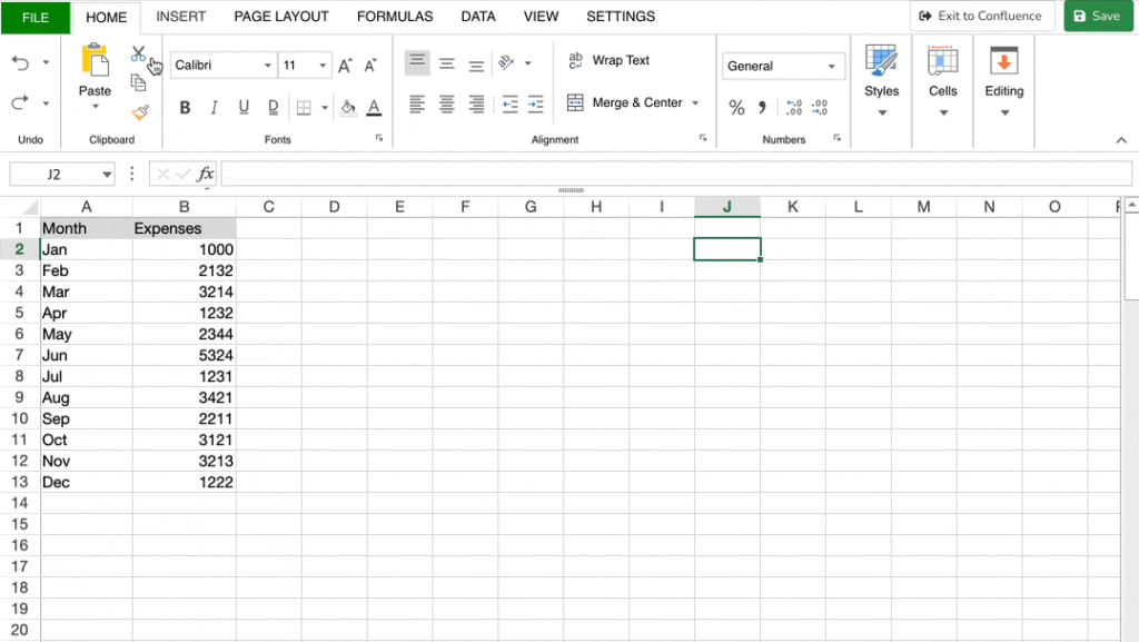
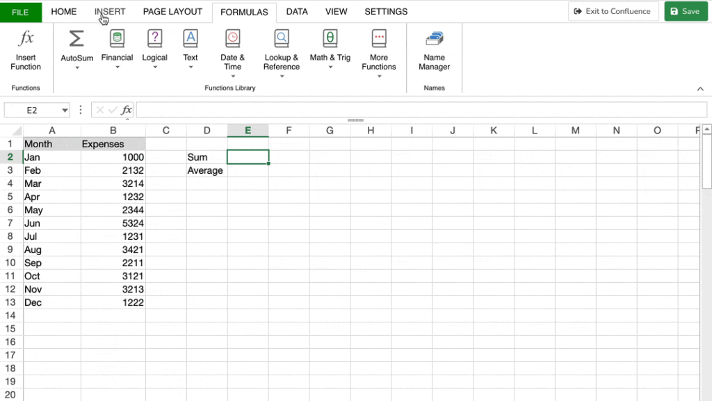
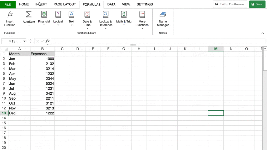
This app is basically a replica of Excel, but it exists within the environment of Confluence. It can meet your data analytics and visualization needs the way Excel or Google Sheets would—except that you don’t have to sacrifice convenience, adaptability, ease of use, and single source of truth (SSoT).


|
|

|
|

|
|

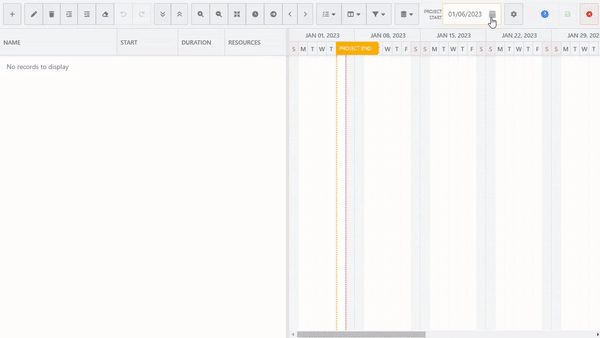
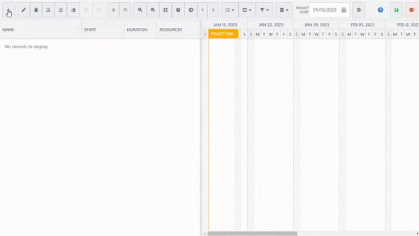
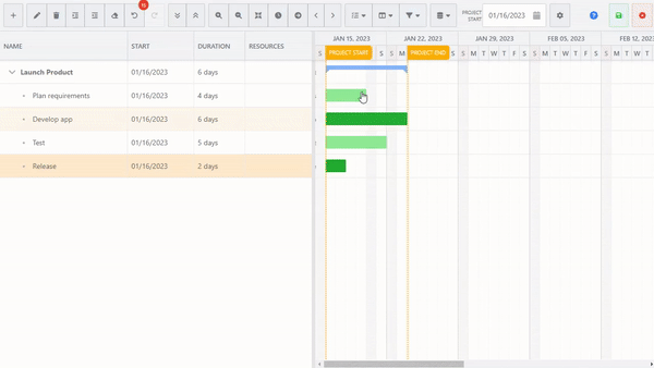
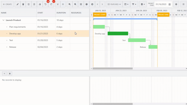
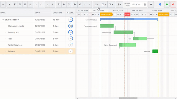
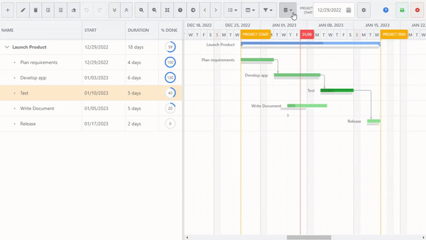
If your needs are heavier on the visualization side and you’re looking for something that can support visual project planning and management in Confluence, then Gantt Chart Planner for Confluence is the app for you.
Unlike Excel-like Tables for Confluence, which is more holistic and full-featured, the Gantt Chart Planner for Confluence caters to users who need a comprehensive timeline management and work planning tool. Its functions mirror those of Microsoft Project.

|
|
While the hiccups a limited Confluence can bring to a business is undeniable, there’s no reason that your team should stay limited and held back by tedious practices just to gain access to data visualization and analytics capabilities.
You have a comprehensive team workspace on one hand and teams waiting to be empowered with data. All that’s left is to take your wiki a step further by equipping it with the necessary data management tools.
